

Featured collection
-

 Sale
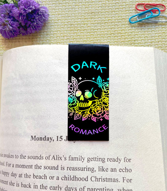
SaleDark Romance
Regular price Rs. 80.00Regular priceUnit price perRs. 100.00Sale price Rs. 80.00Sale -

 Sale
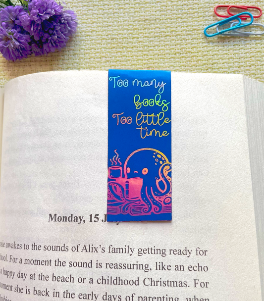
SaleOcto Tales
Regular price Rs. 80.00Regular priceUnit price perRs. 100.00Sale price Rs. 80.00Sale -
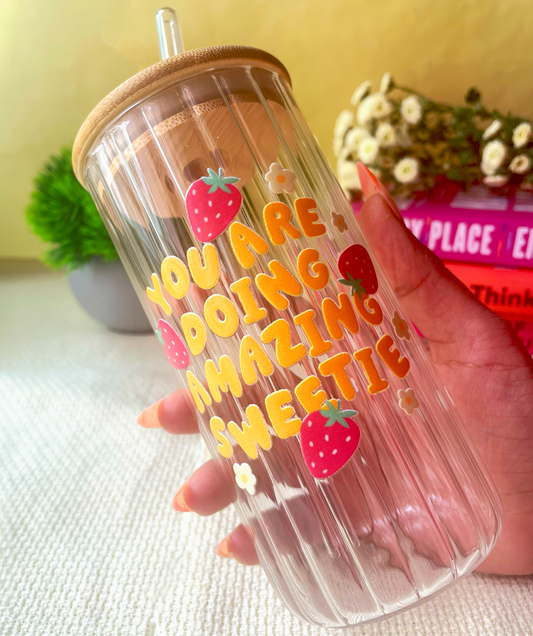
You're Doing Amazing Sweetie
Regular price Rs. 499.00Regular priceUnit price perRs. 799.00Sale price Rs. 499.00Sale -

 Sale
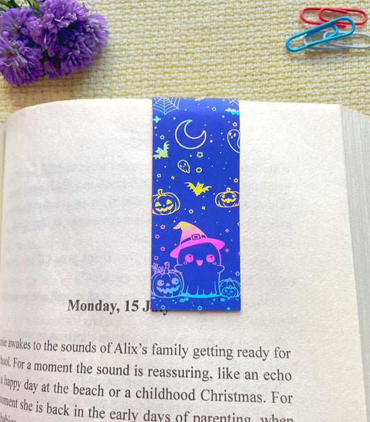
SaleHalloween Ghost
Regular price Rs. 80.00Regular priceUnit price perRs. 100.00Sale price Rs. 80.00Sale -

 Sale
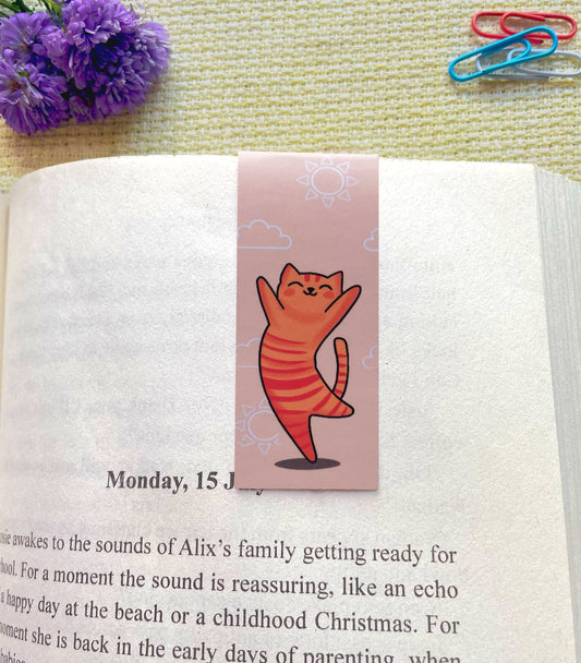
SaleSunny Paws
Regular price Rs. 80.00Regular priceUnit price perRs. 100.00Sale price Rs. 80.00Sale -
Fueled by Iced Coffee and Anxiety
Regular price Rs. 499.00Regular priceUnit price perRs. 799.00Sale price Rs. 499.00Sale -

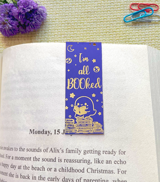 Sale
SaleI'm all booked
Regular price Rs. 80.00Regular priceUnit price perRs. 100.00Sale price Rs. 80.00Sale -

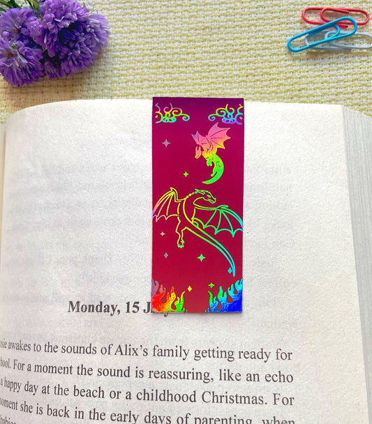 Sale
SaleBook Dragon
Regular price Rs. 80.00Regular priceUnit price perRs. 100.00Sale price Rs. 80.00Sale -

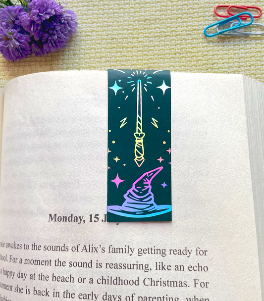 Sale
SaleThe Sorting Spell
Regular price Rs. 80.00Regular priceUnit price perRs. 100.00Sale price Rs. 80.00Sale


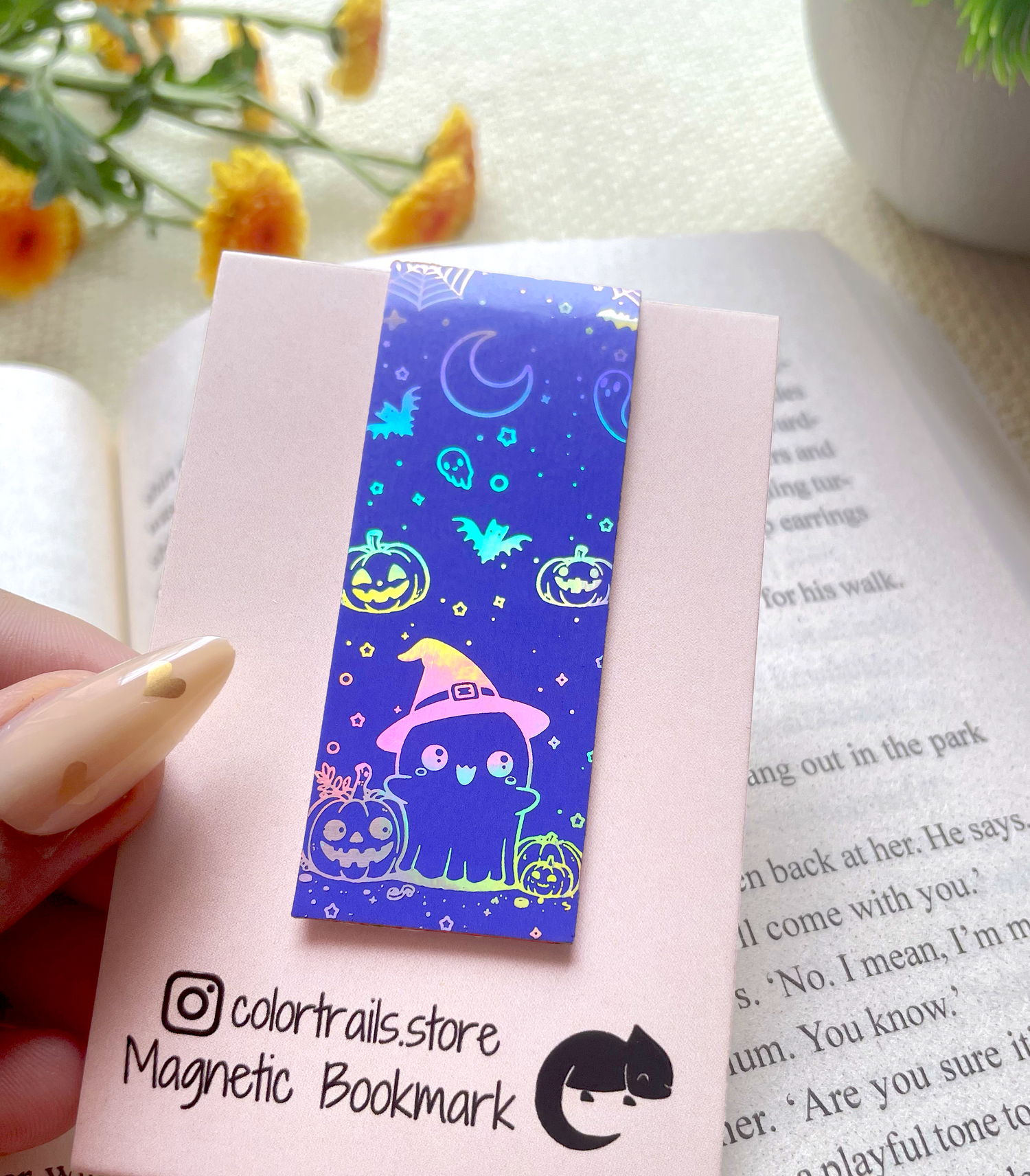
Holographic Foiled Bookmark
Discover the perfect blend of elegance and functionality with our holographic foiled magnetic bookmarks!
Shop All
-

Holographic Foiled Bookmarks
Introducing our exquisite holographic foiled magnetic bookmarks collection. Each bookmark is meticulously crafted...
-

Fluted Glass Cans
Introducing our Glass Cans Collection – a curated range of beautifully crafted...
-

Golden Foiled Bookmarks
Introducing our exquisite golden foiled magnetic bookmarks collection. Each bookmark is meticulously...


